Overall, this piece is more balance. Both are good ... they gave a bit different favour. The first one, in term of color and layout has an antique woody feel to it ... like a classic oriental print. The new version feels more comtemporary and toony. I like the design of the new character a little more, but I like the tiny size of the boy in the older piece.. it gives a stronger contrast. Tough choice ... it's like vanilla ice-cream vs. strawberry ice-cream ...
I kind of like the feel of the older piece, and the boycharacter design of the new piece ... Nevertheless, both are beautiful illos.
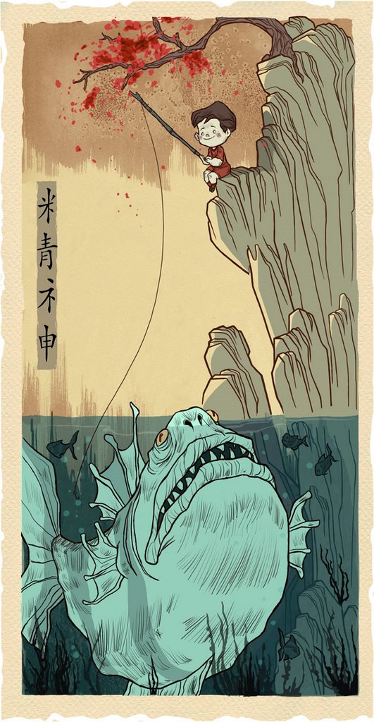
Hey Martin, sweet evocation of Hiroshige, and- who's the other one who did the Wave that you see everywhere - Again, I see really strong connection to Rackham & those classic illustrators. Excellent.
WHAT A BEAUTIFUL SERIES! What are these for? I love them! Very cool style and I love the pallette! I think your 2nd crack at this one was worth it! Making the boy bigger/closer heightens the immediacy and suspense/danger of what might happen. I think he is also framed a bit better. He is definately more the focus, although your eye does move around very nicely. Great piece from every which way!
I agree with you on the this one it flows more as a whole pice now. the fist color of the fish was so stroung it held your entire focus. This one allows for your eye to move around and see all of the shapes.
They're both great Martin, but I have to say I'm partial to the first one. I really like the balance between the red fish and the red tree. Keep up the amazing work!
I like this one better Martin, even though the first one is great. The kid in the first one looked like he knew what he was doing, while the fish looked a bit clueless. Now the fish looks more intelligent and menacing and the child looks a bit oblivious to his situation. Plus the ghostly look of the fish is cool. Whatever, what the hell do I know.
Really interesting! I definately like this one better on a whole, but there's something about the brown tone I like better for the fish in the first one. (Though I realize the new colors work better) Anyways, they're both awesome!
I' ve liked the first one and i still like the way the boy is designed-far up. But i do prefer the cool blue on the fish in the second version- looks spooky and kind of supernatural...
I like it a lot more with the new fish and boy, helps the composition. I really like your line work on this stuff. I used to live in russia soundds like a cool trip. nice work all.
really really amazing stuff you've been doing martin. I personally like this boy better than the last. My favorite is still the tree with the faces though... soooo nice!
I like the fact that the boy is bigger and more visible. Yeah the more exaggerated proportion would make the fish more ominous, but the boy character is designed so well I like having a cleaner look at him.
They're both great, but I do think this one is an improvement. The posture and look of the kid is way funnier and you really capture an underwater feeling better in this one, too.
Oh and without all the red in the fish, I was able to notice something ominous about that tree. Like blood spattering. Perhaps a bit of an elusion to this little fisherman's fate.
The new colors definetly give the work a colder, and more foreboding feel. The blues nicely compliment the warm tones above the water surface, and I really like the re-design of the littel boy.
This is one of my favourite pieces of yours, and a great story all captured in the one image. It has better balance and a better distinction between the two worlds shown...It's brilliant, and I admire you for returning to it! ;)
I think I might have to print this bad boy off ;)...
...And it's mor in keeping with the series thus far leading up to it....they make a really lovely collection, and would make a great little book on their own :)
I think it's definitely better. The only things I like better in the old one are the fish's more protruding eyes, and the little thingies going out of his nose (that are missing in the new one). The kid is much much more to my liking in this new one. D.
i like this a lot, i think that the way you draw it s quiet original and it works perfect on thi one with the fantastic atmosphere. i like this one the most.
Just dropping by and love your work immediately. Awesome!!! So so interesting to see how you playing around with characters. Yet, there's Chinese calligraphy on this piece, which are showed by half, I couldn't help wonder, do you accurately know what it mean and where it from? or it just for composition only? I'm Chinese by the way.
this piece is absolutly fanstastic!! I really love it: the colours, the composition, the little boy... eveything! It's been a while I haven't seen a drawing I appreciate like that! :-)
51 comments:
Overall, this piece is more balance. Both are good ... they gave a bit different favour. The first one, in term of color and layout has an antique woody feel to it ... like a classic oriental print. The new version feels more comtemporary and toony. I like the design of the new character a little more, but I like the tiny size of the boy in the older piece.. it gives a stronger contrast. Tough choice ... it's like vanilla ice-cream vs. strawberry ice-cream ...
I kind of like the feel of the older piece, and the boycharacter design of the new piece ... Nevertheless, both are beautiful illos.
Both are very good, I don't know wich one is better. I like the contrast warm and cold from the last one.
Hey Martin, sweet evocation of Hiroshige, and- who's the other one who did the Wave that you see everywhere - Again, I see really strong connection to Rackham & those classic illustrators. Excellent.
WHAT A BEAUTIFUL SERIES! What are these for? I love them! Very cool style and I love the pallette! I think your 2nd crack at this one was worth it! Making the boy bigger/closer heightens the immediacy and suspense/danger of what might happen. I think he is also framed a bit better. He is definately more the focus, although your eye does move around very nicely. Great piece from every which way!
I agree with you on the this one it flows more as a whole pice now. the fist color of the fish was so stroung it held your entire focus. This one allows for your eye to move around and see all of the shapes.
Another beautiful piece. Keep em comin.
They're both great Martin, but I have to say I'm partial to the first one. I really like the balance between the red fish and the red tree. Keep up the amazing work!
I like this one better Martin, even though the first one is great. The kid in the first one looked like he knew what he was doing, while the fish looked a bit clueless. Now the fish looks more intelligent and menacing and the child looks a bit oblivious to his situation. Plus the ghostly look of the fish is cool.
Whatever, what the hell do I know.
Really interesting! I definately like this one better on a whole, but there's something about the brown tone I like better for the fish in the first one. (Though I realize the new colors work better) Anyways, they're both awesome!
I' ve liked the first one and i still like the way the boy is designed-far up.
But i do prefer the cool blue on the fish in the second version- looks spooky and kind of supernatural...
Hmm, yes. I love them both, but the redesign on the boy here makes it for me. Great stuff!!
I like it a lot more with the new fish and boy, helps the composition. I really like your line work on this stuff. I used to live in russia soundds like a cool trip.
nice work all.
Beautifull thing. What a great taste.
This is a terrific piece, well concieved and balanced. Great job!
really really amazing stuff you've been doing martin. I personally like this boy better than the last. My favorite is still the tree with the faces though... soooo nice!
I like the fact that the boy is bigger and more visible. Yeah the more exaggerated proportion would make the fish more ominous, but the boy character is designed so well I like having a cleaner look at him.
They're both great, but I do think this one is an improvement. The posture and look of the kid is way funnier and you really capture an underwater feeling better in this one, too.
Oh and without all the red in the fish, I was able to notice something ominous about that tree. Like blood spattering. Perhaps a bit of an elusion to this little fisherman's fate.
The new colors definetly give the work a colder, and more foreboding feel. The blues nicely compliment the warm tones above the water surface, and I really like the re-design of the littel boy.
Your a master Martin.
This is one of my favourite pieces of yours, and a great story all captured in the one image. It has better balance and a better distinction between the two worlds shown...It's brilliant, and I admire you for returning to it! ;)
I think I might have to print this bad boy off ;)...
...And it's mor in keeping with the series thus far leading up to it....they make a really lovely collection, and would make a great little book on their own :)
If it is possible for you to improve what is already beautiful- you have done it. Truly a wonderful fantasy .
I love it! It reminds me some of my dreams with dangerous big fish, frightening...!
what a great painting!!!
I like the new little boy and this composition better - but i prefer the color of the old fish.
but then again both are marvelous.....
its a hard choice!
nice.
congrats man... you rocked that show last night. can't believe you sold every piece... well, yeah i can, you're f'in good!
Beautiful!
Love this one and I like the changes you made.
Hans
I think it's beautiful! A real eye catcher.
Love your art, I'll check back again soon!
I think it's definitely better. The only things I like better in the old one are the fish's more protruding eyes, and the little thingies going out of his nose (that are missing in the new one). The kid is much much more to my liking in this new one.
D.
this is a exelen ilustration good power good composition and good palet color congratulations exelent work.
Great picture,Martin!Very nice!:O)
i like this a lot, i think that the way you draw it s quiet original and it works perfect on thi one with the fantastic atmosphere. i like this one the most.
excellent!
i can't help coming back to this piece... my wife find your blog absolutly beautiful ....and she has good taste!!
Beautiful Piece, love you're artwork.
just ammazing :)
That's lovely, the composition and colors are so nice!!!
Martin.....you utterly ROCK man. Send some of that mojo my way.
Just dropping by and love your work immediately. Awesome!!!
So so interesting to see how you playing around with characters. Yet, there's Chinese calligraphy on this piece, which are showed by half, I couldn't help wonder, do you accurately know what it mean and where it from? or it just for composition only? I'm Chinese by the way.
Wow! This piece just makes me really happy. All of your work is amazing. Love your style and color choices. Can't wait to see more!!
Amazing! I just stare... and stare!
My favorite out of the bunch
Great! I love this kind of pics. Really funny!
this piece is absolutly fanstastic!! I really love it: the colours, the composition, the little boy... eveything!
It's been a while I haven't seen a drawing I appreciate like that! :-)
What a great site
» » »
this art is sooo cute!
you work is an inspiration...
L!
A lot of your stuff reminds me of old school illustration like Arthur Rackham and Edmund Dulac,...I love this one in particular,...
great stuff.
-J
haha. you have so many styles.
WOW. ://O
Post a Comment